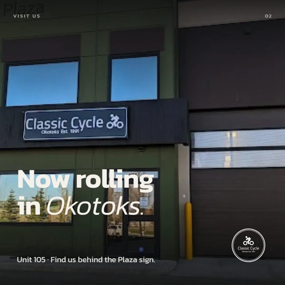
Twenty-five years of small-town word-of-mouth — and a bike floor that outgrew its corner.
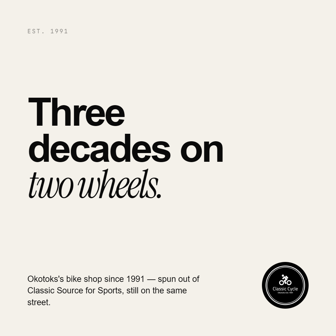
Classic Source for Sports has been on Okotoks's Elma Street since 1991 — hockey sticks in the front, ski tunes in the back, and a bike floor that quietly became the reason most people came in. When the family decided to give bikes a dedicated home under the name Classic Cycle, they needed a standalone identity that didn't feel like a spin-off. It had to carry the equity of a 25-year institution while standing completely on its own.
Client
Classic Cycle (Classic Source for Sports) — Okotoks, Alberta
Industry
Independent bike retail — sales, service, and fitting for all rider types
Project scope
Brand identity, logo design, badge system, lockup suite, social content
Year
2018 — identity still in use on the storefront and social channels
Stand on its own. Keep the equity. Outlast every trend.
The brief came down to three constraints that rarely play well together. Keep the equity — "Classic" had 25 years of word-of-mouth behind it; the new mark had to honour that without resting on it. Stand alone — distinct enough that customers wouldn't think about hockey skates; a bike shop identity, not a sub-brand. Outlast trends — no gradients, no scripts, nothing era-stamping. Something still on the wall in 2045.
Add the practical brief: the mark had to work on a storefront awning, embroidered on a jersey back, stamped on a water bottle cap, cut in vinyl on a frame, and published as a social post — all in one or two colours, at every size from 6mm to 2m.
Monograms. Wordmarks. Pictograms. Then the badge.
Exploration moved across every direction a bike shop identity could take. A monogram built from CC was legible at small sizes but lacked the authority the brief required. Standalone wordmarks were strong for print but fell apart on a jersey back or a frame decal. The badge was the only answer that solved for awning scale, jersey scale, and stamp scale at once.
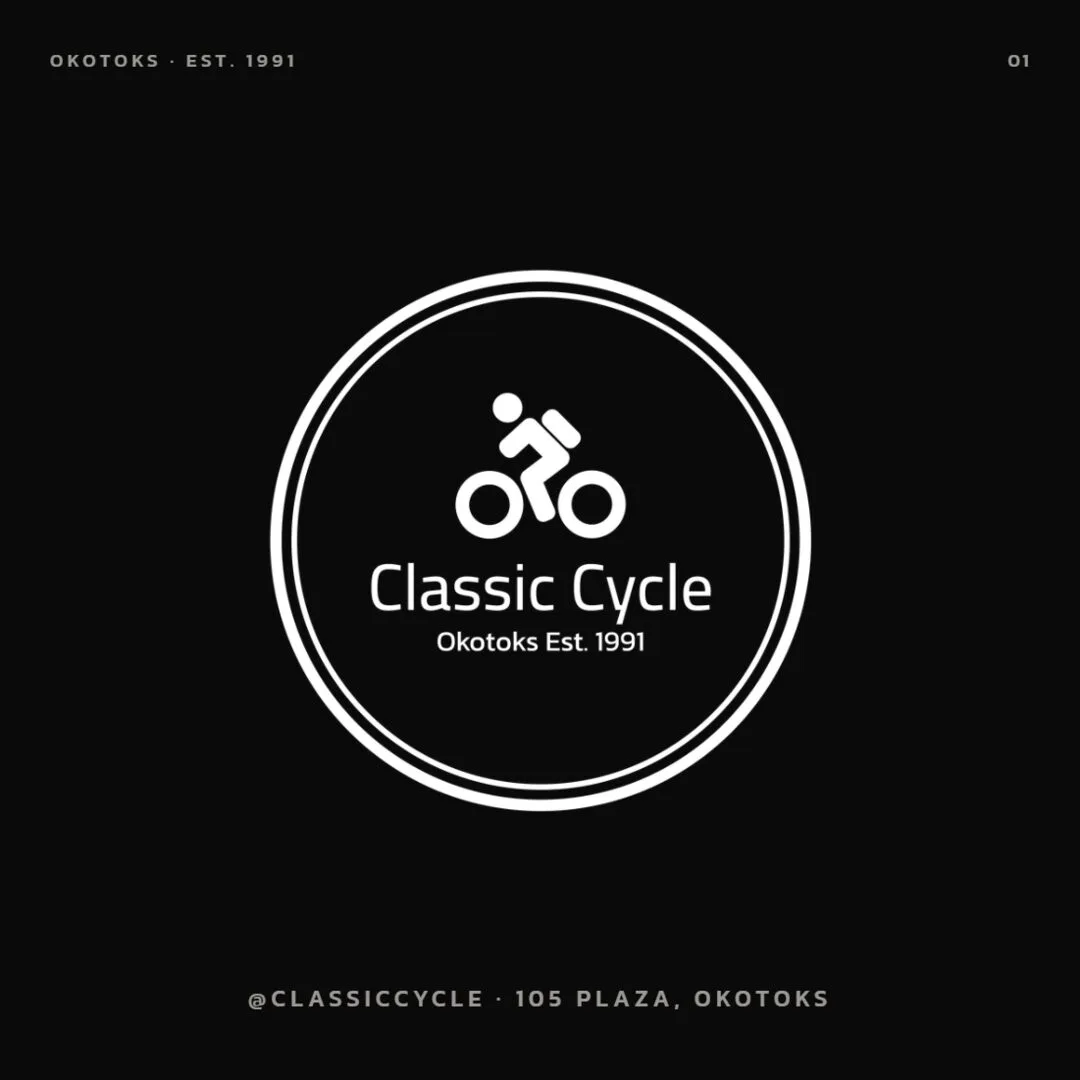
- Double-ring frame — echoes the parent store's badge logic, tying Classic Cycle back to its roots without leaning on them. The rings give the mark its authoritative weight.
- Cyclist pictogram — a figure leaning forward, drawn at a single stroke weight. Communicates motion without decoration. Holds at any size, in any colour.
- Humanist wordmark — set in Helvetica Bold, confident and legible. No custom letterforms, no novelty. The name carries itself; the typeface gets out of the way.
- "Okotoks · Est. 1991" — the detail that earns the trust. Not every shop can say 1991. This one can, and it's planted right in the badge.
- Two colours, no exceptions — Ink (#0A0A0A) and Paper (#F4F1EA). The palette was defined by the awning conversation: if the mark had to read on dark fabric, white paper, brushed window, and black powder-coat, the only answer was ink and paper.
- Six lockups delivered — Primary, Inverse, Badge Only, Horizontal, Wordmark, Stamp. Every application covered without requiring a custom version per use case.
One badge. Two colours. Every surface.
The badge was designed to be equally at home on dark and light — no adjustment, no special version. Same mark, same two colours, whether it's on a jersey, an awning, or a screen.
A shop that opened with its identity already settled.
Classic Cycle launched with a mark that read on the awning, looked right on the jersey, and held up on Instagram — all from the same file. The constraint-first approach meant there was nothing to patch, nothing to explain, and nothing that needed a refresh six months later. The shop is still open on Elma Street. The badge is still on the door.
Identity that travels
From storefront awning to jersey to bottle cap — one badge, six lockups, two colours. Every surface covered without a one-off version.
Zero trend dependency
No gradients, no scripts, nothing era-stamping. Helvetica Bold, Ink, Paper. A mark that looks exactly as right in 2026 as it did in 2018.
Equity preserved
The "Classic" name carried 25 years of community trust into the new identity. A distinct bike shop brand — not a sub-brand, not a rebrand, a new door.
Coherent social from day one
The feed launched with a clear visual language — same badge, same palette, same type discipline as the signage. It looked designed, not assembled.
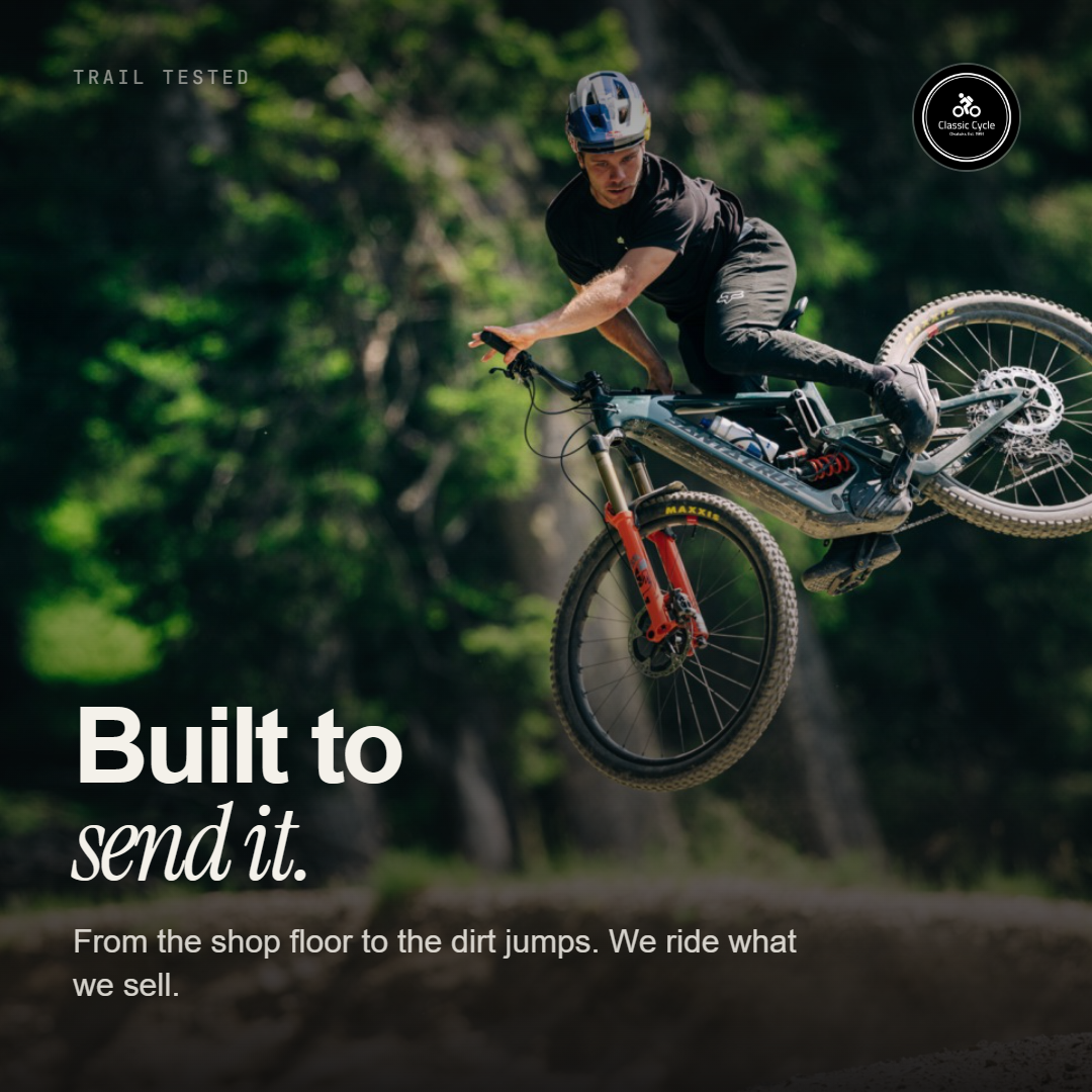
Same mark. Same two colours. Every post.
Classic Cycle's social content was built as an extension of the brand system — not a departure from it. The brief was simple: if the badge can't go on it, it doesn't go out. That single rule kept the feed coherent across launch week and beyond.
The delivered scope.
- Badge identity system — cyclist pictogram inside a double-ring frame, built to work in one colour at any scale from 6mm to 2m.
- Six lockups — Primary (badge + wordmark), Inverse, Badge Only, Horizontal, Wordmark, Stamp — every application covered without custom per-use work.
- Two-colour palette — Ink (#0A0A0A) and Paper (#F4F1EA), specified for print, screen, embroidery, and vinyl.
- Typography system — Helvetica in three weights (Bold, Regular, Light), with usage guidelines for signage, body copy, and spec sheets.
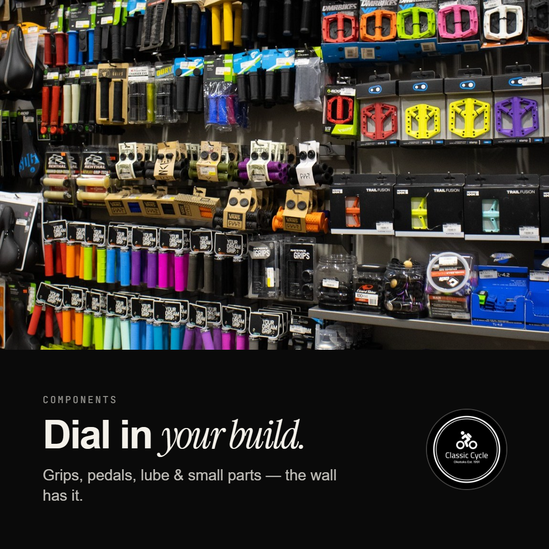
- Brand in context — applications across storefront awning, window signage, business cards, frame decals, club jerseys, and water bottles.
- Social content suite — launch posts built to the same badge-and-palette discipline as the physical brand, ready to publish on opening day.